

See Pork in Congressional Bills with AI!

Abstract:
This study undertakes the comprehensive analysis of the 118th Congress HR 4366 Consolidated Appropriations Act OMNIBUS Bill, aiming to elucidate the distribution and significance of earmarks within its 1050-page expanse. Leveraging advanced data analytics techniques, the bill is dissected, decomposed, and visualized in a multi-dimensional space to unravel underlying patterns and insights. In conjunction with anchor.ai, this documents the employment of K-means clustering, Principal Component Analysis (PCA), and other statistical methodologies. The study delves into the structure of the bill, identifying key earmarks, agencies, and expenditure trends. Through meticulous data cleaning, exploratory analysis, and visualization, the research unveils nuanced relationships and trends embedded within the bill's contents. The project's outcomes encompass a descriptive K-Means model, exploratory graphs, and a comprehensive dataset, serving to enhance taxpayer awareness and policy-makers' understanding of legislative contents.
Research Question:
Can a descriptive K-Means model be developed from the data?
Null Hypothesis H0:
The distribution of earmarks is random.
Alternative Hypothesis H1:
The distribution of earmarks is not random.
Context:

The contribution of this study to the field of Data Analytics and taxpayer awareness is to create K-Means test to investigate possible earmarks in the: 118 Congress HR 4366 Consolidated Appropriations Act OMNIBUS Bill. With this information tax-payers and policy-makers can be more situationally aware of the bills contents. No similar studies have been conducted documenting the decomposition of a raw bill and exploring it in vector space. Other studies such as, Predicting the Path of Congressional Bills, have used pre-cleaned labeled data to predict congressional bill variables not germane to this study (Ejafk, 2017). Another common practice of tokenizing congressional bills, is captured in the study by the National Institute of Medicine; Predicting and understanding law-making with word vectors and ensemble model (J Nay, 20217). While these two cited studies involved congressional bills, this is the first study of its kind that views the possible earmarks in bills in 3D vector space and visualizes differences in groups of the bill.
Data:
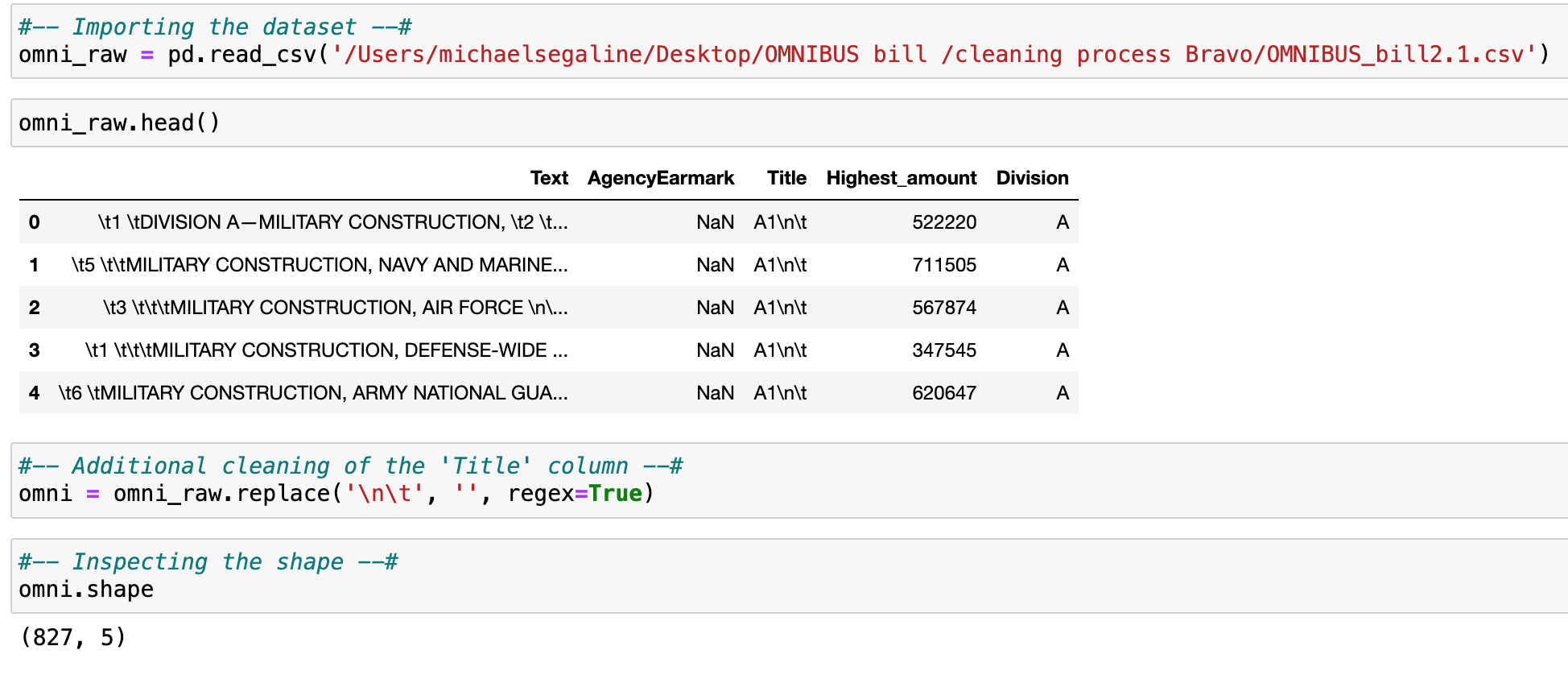
The data consists of a .docx file of the Congressional OMNIBUS bill which can be publicly accessed from congress.gov. Congress.gov is the opensource repository / organization that hosts the datasets. Moreover, the docx file contains 1050 pages of the original bill. The dataset is limited to only (1) OMNIBUS Bill; Uploaded February of 2024.
Data cleaning was a two phase process: Bill parsing into a clean tabular format and exploration of the tabular bill data.
Here is a link to the dataset for follow along and replication:
https://www.congress.gov/bill/118th-congress/house-bill/4366Available to the public via the Government, meaning that the dataset may be limiting in accuracy and completeness.
Below is a list of the parsed variables derived from the 4366 consolidated into the following features in tabular format.


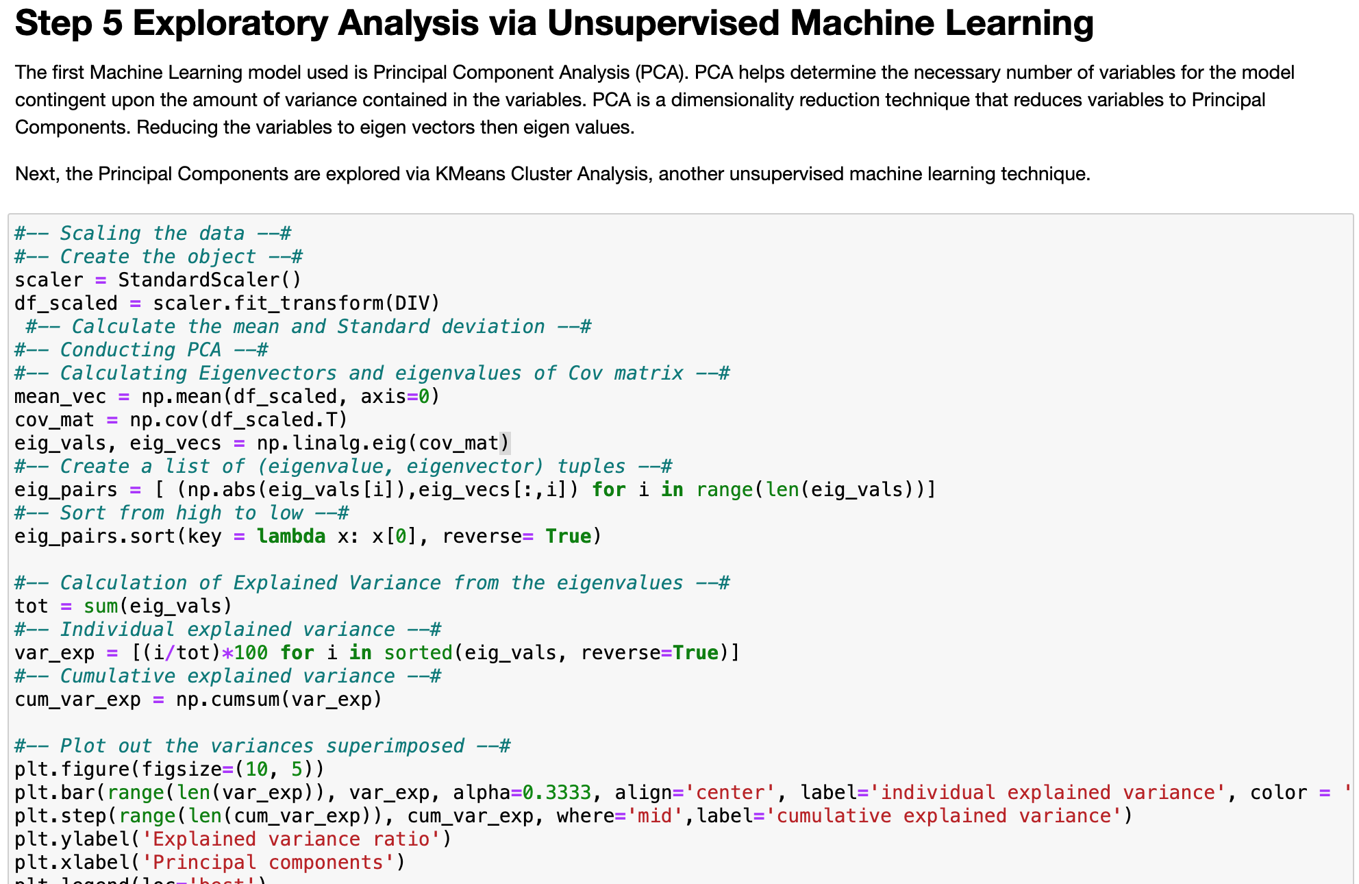
After identifying these continuous variables and these groups, we can identify them by a specific cluster number. K-means clustering is an unsupervised machine learning algorithm that classifies and groups ‘like’ variables. When populating a scatterplot of datapoints, it may be visually apparent how many distinct groups there are; sometimes not. Therefore, the user must define the number ‘k’ of clusters as points to be randomly plotted in the scatterplot. The number of clusters centroids are plotted and distances to all data points are measured. Next, a process called “fitting” and “transforming”, where the centroids are serially readjusted or moved to the ideal center of the cluster. Finally, the average distances are minimized until ‘k’ defined centroids are at the optimal center point to all the points defined in their clusters.
Now, fitted and transformed, a random unlabeled data point can be plotted and predicted as to which cluster it may belong. Elaborating the k-means process is towardsdatascience.com, “Step 1: Specify number of clusters K. Step 2: Initialize centroids by first shuffling the dataset and then randomly selecting K data points for the centroids without replacement. Step 3: Keep iterating until there is no change to the centroids. i.e assignment of data points to clusters isn’t changing. Step 4: Compute the sum of the squared distance between data points and all centroids. Step 5: Assign each data point to the closest cluster (centroid). Step 6: Compute the centroids for the clusters by taking the average of all data points that belong to each cluster” (2021). Moreover, one assumption of K-Means is that humans must assume the ideal number of clusters based off hasty methods; The same assumption is also a limitation.
A handy package that facilitates this analysis is sklearn, because it’s a great statistical library and one-stop-shop for all functions required for this assignment. With sklearn, we can import the preprocessing method for scaling the data. Sklearn also has Principal Component Analysis (PCA), that can be imported to reduce the dimensionality of the dataset via the decomposition method. PCA reduces the complexity of the dataset for faster computation times. Most importantly, sklearn has a cluster method, the KMeans function, that can be called; Saving a lot of time an code. The pandas and numpy libraries are necessary for quickly manipulating large datasets. Additionally, matplotlib and seaborn libraries are great visualization tools for this analysis because they are easy to implement and helpful for data exploration.
Each of the steps to clean the data are as follows: First import the dataset and drop the null values. Next separating the continuous variables from categorical and explore the continuous variables in a correlation matrix. Third is to drop all unnecessary or correlated variables and scale the data. Fourth: PCA is then conducted to reduce the dimensionality of the variables and extract features into Principal Components. From that point, the PCs are explored for individual and cumulative variance; Unnecessary PCs may be dropped. Fifth: the number of ‘k’ clusters will be determined via the elbow method. Then the kmeans() function will be called with the number of clusters predetermined by the Elbow plot analysis. Lastly, the scaled and transformed datapoints will be plotted on a scatterplot to visually analyze the effect of the patterns of clusters when trying different numbers of ‘k’.
Data Gathering:
Plan and direct data gathering to congress.gov. Next, selecting the .docx file indicating 118 Congress HR 4366 Consolidated Appropriations Act OMNIBUS Bill.
In K-Means, the dependent variable must be a continuous (interval or ratio) level of measurement (Statology, 2019). Fortunately, all dependent variables are continuous. The dataset is 0% sparse with no missing or null rows once the tabulated. The final cleaned reduced a 1050-page Bill to dataset is 827 instances of topline spending.
Data Analytics Tools and Techniques: A KDE plot was used to visualize the distribution for normality. K-Means is germane to studying this data because it can compare distributions of data of non-parametric data.
However, the K-Means test does not assume normality in the data (Statology, 2019). Overall, this is an exploratory quantitative data analytic technique and a descriptive statistic. The tools used will be Jupyter Notebook operating in Python code, running sklearn api as a reliable open-source statistical library. Due to the data size, a Pandas data frame will be called, same with Numpy and Seaborn will be used for visualizations. A K-Means and PCA tests will be the statistical test used with sklearn’s K-means function. In conjunction with a presentation layer consisting of Univariate and by Bivariate graphs.
Justification of Tools/Techniques:
Python will be used for this analysis because of Numpy and Pandas packages that can manipulate large datasets (IBM, 2021). The tools and techniques are common industry practice and have consensus of trust.
The technique is justified through the integer variables necessary to plot against a timeline. In so doing, may just reveal different modes of frequency distribution. Another reason why K-Means test is ideal is because the data is based off human behavior, which is notoriously skewed. Python is being selected over SAS because the Python has better visualizations (Panday, 2022).

According to Scikitlearn.org K-means clustering is based on several assumptions:
Clusters are spherical: K-means assumes that clusters are spherical and have similar sizes. It calculates the centroid of each cluster, and points are assigned to the nearest centroid. This assumption implies that the clusters have roughly equal variance along all dimensions.
Equal variance: K-means assumes that the variance of the distribution of each variable is the same for all clusters. If the clusters have vastly different variances, K-means may not perform well.
Clusters are non-overlapping: K-means assumes that each data point belongs to only one cluster. This means that it partitions the data into distinct non-overlapping clusters.
Linear separation: K-means works best when clusters are linearly separable, meaning that they can be separated by hyperplanes in the feature space. If clusters are not linearly separable, K-means may produce suboptimal results.
Number of clusters (k) is known: K-means requires the number of clusters (k) to be specified in advance. It is sensitive to the initial choice of centroids, and the quality of clustering can vary based on the chosen value of ‘k’.
Symmetric clusters: K-Means assumes that clusters are symmetric and isotropic, meaning they have a similar shape and size.
Project Outcomes: In order to find statistically significant differences, the proposed end state is a K-Means descriptive statistical model that can compare the distribution shapes of the targeted groups (Statology,2019). A cleaned dataset of all the correctly labeled columns and rows, for replication. A better understanding of previously stated groups with exploratory graphs, giving support as to what time engagement maybe highest. Lastly, a copy of the Jupyter Notebook with the Python code will be available, along with a video presentation added by PowerPoint. Primely, this is the first study of its kind and to show support for the alternative hypothesis of K-Means given a word document of Congressional Bill.
Here is the link to the code in Github.
Below is the python code:


The below shows the WordCloud output of all the text in the parsed dataset; The word size indicates the frequency.


The above correlation matrix is too messy to discern much information; Therefore the dataset will be separated into two different datasets for Titles and Divisions.


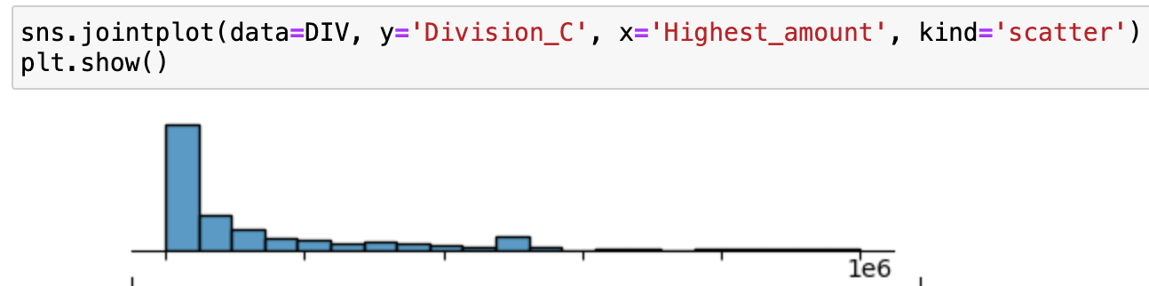
Below is a correlation matrix comparing the Highest_amount compared against different divisions.


When going into bivariate exploration of Highest_amount against Division, all the distributions have the same matching left-skewed distribution. What is interesting is the raised ‘out of place’ bin in the center of all the graphs.


See like the machines, with K-Means.
Imagine you are in a spaceship, and you are approaching a galaxy from a distance and you ask your ship's auto-navigator to show you the entire galaxy as one grouping. The auto-navigator will move the spaceship to reorient in space, displaying to you the entire galaxy as one group. For each cluster number, the spaceship reorients in space / time, most effectively displaying to you the different star color groups in space-time.
Exploring Principal components in this space can reveal patterns that can be better understood or exploited by other machine learning models.
Below is the cluster of residuals in 3D space indicating the different groups of Divisions, in different colors, in vector space.
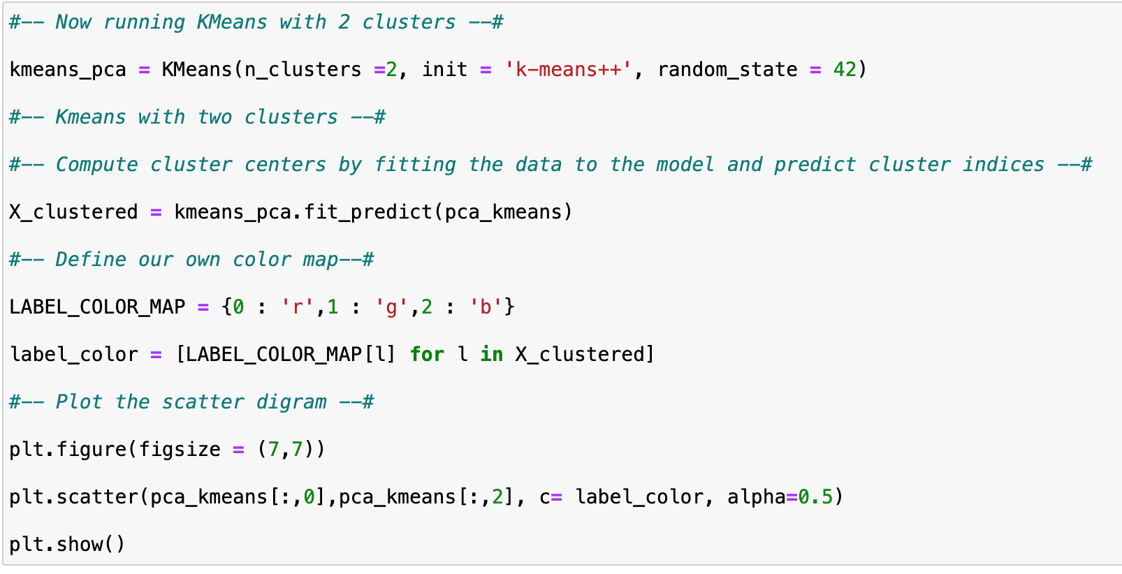

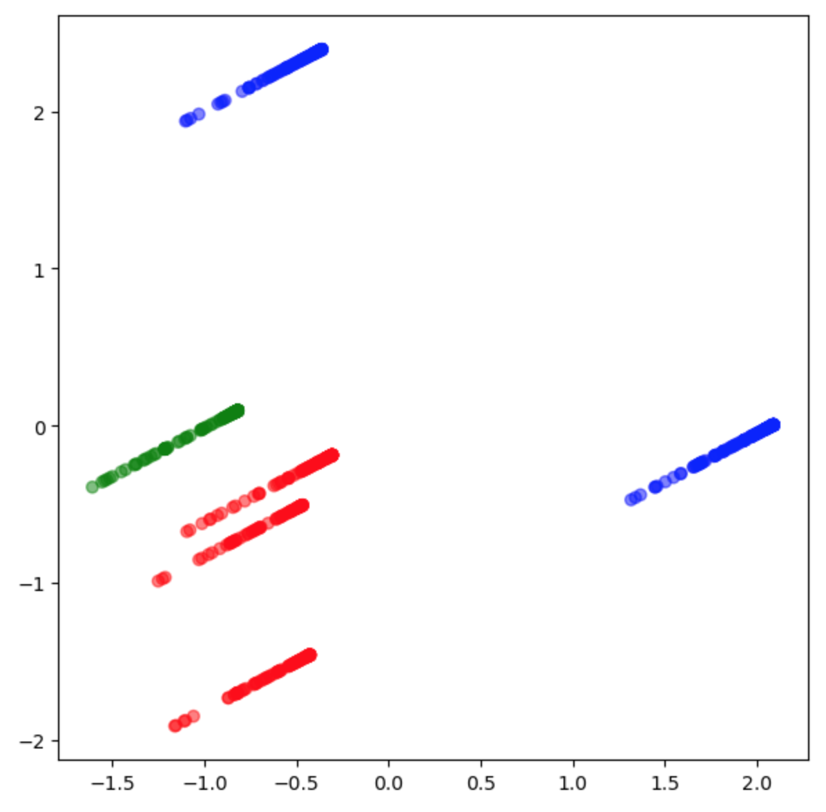


Below is the cluster of residuals in 3D space indicating the different groups of Titles per division, in different colors, in vector space.The bill is visualized in 3D space amongst various ‘k’ clusters which exposed individual strata-lines of residuals. The different colored strata-lines are observed, indicating a difference from the other colored groups.
When exploring the ‘Titles’ the cluster groups resembled the rectangular shape of a paper bill with lines of strata separated from the bill body.
Moreover, the strata-lines blob-up and show density in differences in the bill body.


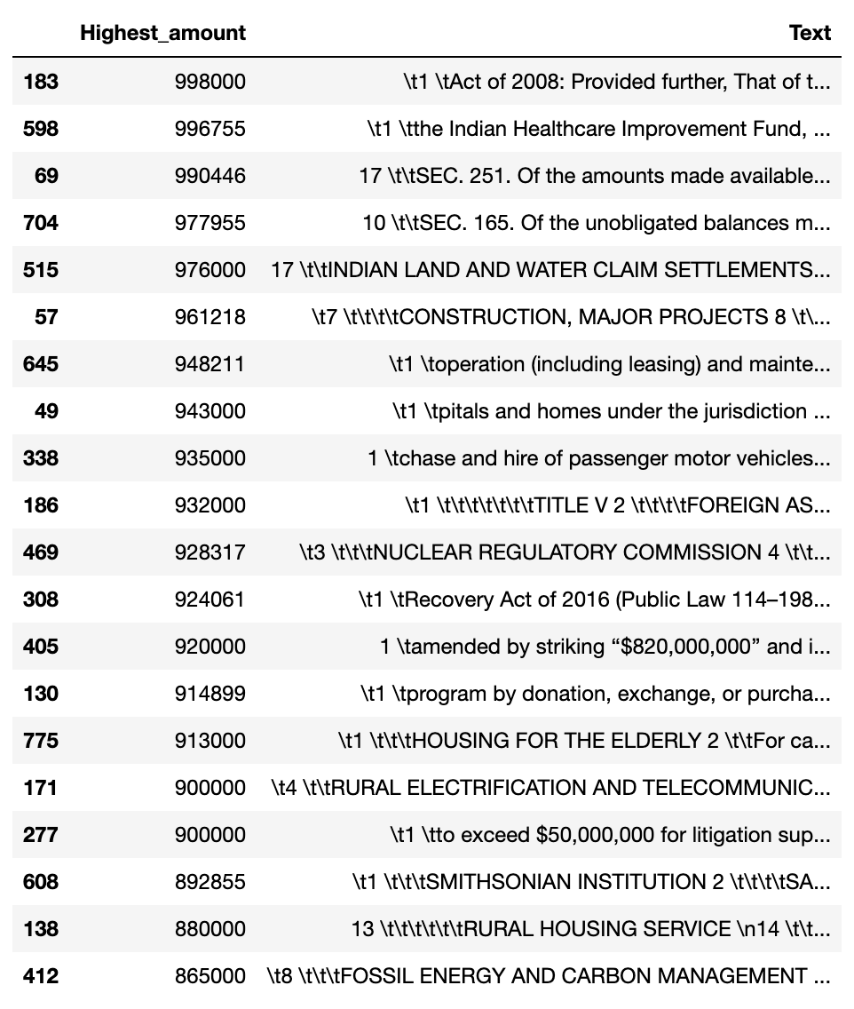
In final analysis, the study pioneers a groundbreaking endeavor in the realm of data analytics, offering a novel perspective on the analysis of legislative documents, specifically the 118th Congress HR 4366 Consolidated Appropriations Act OMNIBUS Bill. Through meticulous data gathering from congress.gov, the bill undergoes a rigorous two-phase cleaning process, culminating in a tabular dataset comprising 827 instances of topline spending. Leveraging Python-based tools and techniques such as K-means clustering, PCA, and visualization libraries like Matplotlib and Seaborn, the study unravels intricate patterns within the bill's contents. Notably, the exploration extends to 3D visualization, shedding light on the distribution of earmarks and expenditure trends. The top 20 earmarks or agencies were aggregated, along with where to find them in the bill. Also, generated visualizations of the variable distributions.
Additionally, produced was a hasty sentiment analysis by exposing correlations between the individual title per division by the ‘Total_Amount”.
Lastly, we reject the Null Hypothesis in H0 favor of the Alternative Hypothesis H1: the distribution of the residuals is not random.
The bill was visualized in 3D space amongst various ‘k’ clusters which exposed indivual strata-lines of residuals. The different colored strata-lines are observed, indicating a difference from the other colored groups. When exploring the ‘Titles’ the cluster groups resembled the rectangular shape of a paper bill with lines of strata separated from the bill body. Moreover, the strata-lines blob-up and show density in differences in the bill body.
The project's significance lies in its potential to inform taxpayer understanding and policy-making decisions, offering a deeper insight into the dynamics of legislative appropriations.
Work Cited
Dabbura, I. (2022, September 27). K-means clustering: Algorithm, applications, evaluation methods, and drawbacks. Medium. https://towardsdatascience.com/k-means-clustering-algorithm-applications-evaluation-methods-and-drawbacks-aa03e644b48a
Ejafek. (2020, July 7). Predicting the path of Congressional Bills. Medium. https://medium.com/@elizabethjafek/predicting-the-path-of-congressional-bills-cf1105f7c6c8
How to combine PCA & K-means clustering in Python. 365 Data Science. (2024, April 15). https://365datascience.com/tutorials/python-tutorials/pca-k-means/
Nay, J. J. (2017, May 10). Predicting and understanding law-making with word vectors and an ensemble model. PloS one. https://www.ncbi.nlm.nih.gov/pmc/articles/PMC5425031/
Pandey, Y. (2022, May 25). SAS vs python. LinkedIn. https://www.linkedin.com/pulse/sas-vs-python-yuvaraj-pandey/
Robinson, S. (2018, November 19). Classifying congressional bills with Machine Learning. Medium. https://medium.com/@srobtweets/classifying-congressional-bills-with-machine-learning-d6d769d818fd
Sklearn.cluster.kmeans. scikit. (n.d.). https://scikit-learn.org/stable/modules/generated/sklearn.cluster.KMeans.html
Team, I. C. (2021, March 23). Python vs. R: What’s the difference? IBM Blog. https://www.ibm.com/cloud/blog/python-vs-r
